So now it is unavoidable. Those of us that build websites have to adapt to screens that are as high resolution as print such as Apple's Retina displays and range in size from tall and skinny iphones, to HD TVs, iPads, and a world still full of various laptop and desktop screens. Fine. Challenge accepted.
First challenge - what resolution do we use in Photoshop?
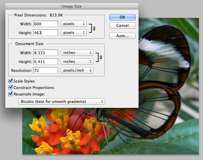
Since most designs start in photoshop - a common task is to create an new blank canvas. The only thing that matters is the number of pixels. The pixels per inch is only matters for print. It does nothing for screens. You will notice that when you save for web - pixels per inch is not an option you can tweak - BECAUSE IT DOESN'T MATTER.
But - If you want to PRINT your stuff - the set your canvas up as the same number of pixels but 300 pixels per inch. Here is an example. Notice that changing the pixels per inch only affects the "document" size (i.e. the printed size) - at 300 pixels per inch the document size is only 2 inches (again, this does not matter for ipads or any other screens)
[ ](https://www.benshoemate.com/wp-content/uploads/2012/07/300 pixels per in.png)
Same image, same number of pixels, same DATA at 72 pixels per inch.
[ ](https://www.benshoemate.com/wp-content/uploads/2012/07/72pixels per inch.png)
So here is a plan - if you want to print your comps and have them look good on paper - you need to set your resolution high. But when you slice this up and make a website, it will all be pixels anyway.
More tests.
Take a look at the two images below on an ipad. Both are set in the HTML to be 300 pixels wide. But behind the scenes, the left actually twice the size of the other (600 pixels wide).
HTML width 300px; Image 600px:

HTML and real width 300px:

Theoretically, the one on the left will look better on the ipad or a high res display. If you print this document, the image on the left might also look better. But from a web perspective, they are both the same.
One more trick
If you want to get fancy you can do what Apple does on their website. They have images at double resolution (like the example above) and swap them out with javascript if they detect the user has a high resolution device.
Some more information on how to do this can be found here: