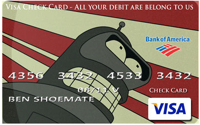

About a year ago I switched over to Bank of America. Since then, when I go out to lunch or dinner with friends I’m always regretting that I have such a boring credit card. In a large group there is always multiple people with the same card. Where is the individuality? As a creative person this really bothered me. So I decided to take matters into my own hands.
Option 1) Spray paint the card a solid color. This works well. I spray painted it solid silver for a few days, then solid black. The black card was well received but I found out that many merchants need to know what kind of card it is. So I looked into other options. Note: you need to remove the spray paint with sand paper, but be careful around the numbers before you try the other options. Otherwise the card starts to get too thick with paint. For my wife’s I tried solid pink and stuck a visa sticker on it from option 3 below.
Option 2) Iron on transfer paper: This was what another site proposed. this did not work well for me. The theory is design your card in photoshop and print it onto Iron-On T-shirt Transfer Paper ($10 at your local hobby store). Cut out the design, use spray on poster board glue to secure the transfer to the card and iron on low heat. I did not like this. In all my attempts the card ended up too thick to use at swipe ATMs. Plus, the iron removed raised numbers from the back. Note, the numbers are not part of the card design – I added fake numbers to the picture just to illustrate – you want the raised original numbers to come through which is why this option sucks.
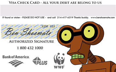
Option 3) Recommended. Buy some quality Inkjet sticker paper. Print your card design and stick it to the card. You can do front and back just on the back, do not cover the magnetic strip. The stripe WILL work through the sticker but having a stick on front and back makes it too thick (or so my wife says). Once the sticker is in place take a knife and lightly scratch back and forth across the numbers to make them come through and continue to press the sticker down around the numbers as they come through. Mine looks and works perfectly Again, the numbers are not part of the card design – I added fake numbers to the picture just to illustrate – you want the raised original numbers to come through. Here is the back:

I am still experimenting to try and give the card a good plastic look. At first it looked and felt a little to “papery” so I sprayed a coating of gloss on it.
[…] those of you who are artistic and enjoy a craft project like myself, make sure to check out this other hit I received from my search on Google regarding different techniques one person has used to […]
[…] Pimp your Credit Card […]
Haha Bender Bending Rodriguez
This is quite funny, but I have to admit that “pimping” your credit card could prove to be a successful product on the market. Nowadays, from cell-phones to laptops, you can personalize your product. This is a very good idea.
_____________________________________________________
Credit Cards Instant Decision
Many banks have that option today where you can add your photo on the credit card. The photo isn't necessarily yours, but mainly something that you want to be there. Some people put photos with their pets. That is nice.
____________________________
Sightline Payments
This is kinda cool. Just realize though that just because you can get “cool looking” credit cards doesn't mean you should use them!
Thanks for the info! It took some time to catch on but I’ve got it now. thanks.
If you want to visit my site http://www.orchardbank.com.
—————————
Thank you for this infomation,i am beginner to make blog . it is very helpful for me.
visit my site http://www.orchardbank.com.
I have to admit my GF has a Bank of America bank card that she did her self but BOA actually has custom credit cards now. Just another way to get you to spend money and choose “their” product. It's a great marketing technique since everyone want's to have their own flavor added.
Great share. In my opinion, customer service should be on top of banks’ priorities. Some fail because of the unnecessary http://www.chase.com meticulous details that they pour upon redundant factors. But of course there’s always room for improvement, that I hope the others would follow.
There is another link under the category of personal finance but it has nothing to do with finance. If you have difficulties in making payment, you can click the link named wachoviabank.com. You will have an expert helping you to fix your problems and you don’t have to go out of your home to get the service. What you need to do is to choose a button between the two “call us today†and “we’ll call youâ€. Don’t you think this service shows the attentiveness and consideration of the Wachovia? It’s really good in my opinion.
test
check out ssgl.com and their solution for capitalone credit cards. but I love your creativity
Hey, Visa launches a new model of credit card. you might try checking it.
Bank should change their cover on their credit card. People nowadays prefer a better looking or different cover on their credit card.
Love the way the robot on the back of the card looks directly at the signature so that when someone turns over your card they look at your signature! Pimpin!
Love the way the robot on the back of the card looks directly at the signature so that when someone turns over your card they look at your signature! Pimpin!
At least some credit card companies offer an option to upload your own photo while filling out the online application. I found some design ideas here: http://trick77.com/2010/05/09/design-personaliz…
The good thing is that the image will be printed onto the card with a professional printer. The bad thing is that you probably can't use any copyrighted images/symbols whatever.
Nice information.And now a days there are a lot of facilities offering by different banks so that to increase the user rate.And recently military credit cards are offering the best facilities.The best thing about this card is it automatically pays you the rewards in your account monthly without the usual $50 minimum like most credit cards.
Hey Ben! We actually have a patented product called CreditCovers, skins for credit cards, which you can use to skin your card with anything you like. If you head over to CreditCovers.com you can pick something out, and if you use the code: CCFOF your first skin will be FREE (you will need to pay our fulfillment company the S&H however)