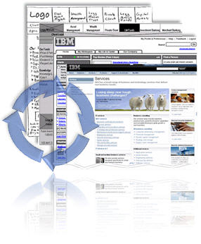
 I did a presentation on design methodology to a potential client a couple of weeks ago and was asked a question that threw me a little off guard at the time: why are you prototyping before you have a site map?
Before I answer, let me give you a little background –
This client (an international corporation) was looking for a partner to redesign their entire online experience and the back-end tools they would use to manage it. I was at the part of the presentation where I explain the importance of prototyping – that is, drawing a picture, mocking up the interface, wireframing, whatever you call it. In other words, prototyping is visualizing the finished product in incremental steps of higher fidelity until you have refined it into an exact replica of the product to be built. All the developers need to do then is insert the magical fairy dust that brings it to life (they can even reuse all the HTML, CSS, and most of the JavaScript).
I prefer to do go ahead and start with HTML. It is faster, and more flexible for me than to mess with paper prototypes, powerpoint, visio, etc. But you can begin with a sketch on a napkin (though dry erase boards are less likely to be picked up and thrown away by your waiter). In the beginning, my HTML protoypes are just grey boxes and faux latin and I call it a wireframe. As I apply real labels and navigation, I start calling it a low-fi prototype. And when I start adding color, branding, images and real example content, I start calling it, well, I just call it “the prototype”.
So as I am explaining this, I state, “We begin visually prototyping and mocking up on day 1.”
The client stopped me here – “But why would you prototype before you have a sitemap?”
The answer is the prototype is not only an end-product, but it is also a tool that is used at every step. The purpose of the prototype is to take the concept, at whatever stage of development it is in, and breath life into it so you can see exactly what it means to have this link here, and that link there. You can see which concepts work and which do not (and kill the bad ones before they become politically entrenched). It would be a huge mistake to spend weeks defining a site map, building consensus across the various stakeholders, discussing that site map with users, and then, after it is signed off, only then begin to create a prototype so we can finally see what we are talking about.
Begin with the end in mind
When you want to design a website – you begin with a website in mind. Other things are important too of coarse, but after a few meetings with users and stakholders, after listening to them talk about the purpose, mission, and goals they want to accomplish, a vision of the site should start to appear in your mind. By putting this down on paper (or in HTML), you can return to those meetings with something to discuss, something more powerful than words alone. The mistake I see a lot of projects make, is waiting too long to start prototyping. They end up with long feature lists, huge spreadsheets of design ideas and requirements, or a site map that shows what the navigation must be. This creates artificial limits and arbitrary political boundaries, where usability and good design sense says one thing but the spreadsheet says something else. At this point you get push back. The client PM will tell you “Oh, we can’t go back to the VP of communications and tell them there is not enough room on the home page for all 600 executive biographies” (I joke, but this is sadly close to reality). In fact, it is very difficult to read a long list of requirements and spot things that are contradictory, but the prototype is not so forgiving. When you start mocking it up, and one line says links should be grey, and another says they should be blue – something has to give (and no you can not have both!).
I’m not saying that things like site maps are not important, what I’m saying is that I like to do them in parallel. If we sit down in Visio or Freemind and define a preliminary site map in a couple of hours, then I am going to go back and sketch out what that might look like. That way, before we commit to 100 links on the homepage, we will know exactly what that might look like and have a chance to discuss it. Prototyping, for me, is HOW the site map is defined. Otherwise once you start putting pen to paper, you will have no discretion, no freedom left to design.
I hope that this is clear, but just in case, let me breifly hightlight the benefits of prototyping, that is, visualizing your finished product throughout the entire process. I constantly forget (because I literally do it everyday) that not everyone understands or agrees with this.
- Prototyping assists in the gathering and validation of requirements with stakeholders, making it faster and more accurate – the alternative is relying on written descriptions of the requirements, often captured in spreadsheets. Sometimes this is done by the client prior the start of the project or by a team that does not have design skills required to build a prototype. When this happens, and I walk in and am handed a huge spreadsheet of signed-off, set in stone, validated requirements, a huge red flag goes off – Its a trap! Run for your lives! Why do I say this, because these spreadsheets of “requirements”, invariable contains design decisions that were made without any  I tend to treat these as little more than brainstorming from the client. I have to, if I don’t and we call this list of feature “requirements” then the project is already in trouble. Why? because now we have a document that states what features the site will have rather than what the actual goal is. Tell me the
- Usability validation and refinement with users can begin very early
- Developers and programmers can make better plans – because at any point in the design process, I can site with developers (or anyone really) and show them what we are thinking, where we are going, they are better able to make accurate plans. Other wise, I have seen projects where the developers are handed documents and left with their imaginations to interpret things and not getting the wire frames (really graphic design comps) till half-way through development. (This is one of the risks of not having a tech savy Information Architect on your team. To often it is programmers and graphic designers and no one in between – huge mistake.)
- Adoption and cooperation is easier to obtain – let’s face it, getting things done inside corporations can be tough. The best way to get things moving is to be able to clearly and concretely articulate your vision, what you hope to accomplish and the value to your audience. The best way to do that is to show them.
- Another side effect of having a prototype so early is that the business transformation planning and communication can begin.
It is never too early to start prototyping. I have done dozens of vision prototypes – these are done before (sometimes years before) the actual project to build the site even begins (you have to remember I build huge, complex enterprise portals and intranets so these things take time). These vision prototypes help the client explore their options, build a business case, and shop it around internally to find funding and build support. These vision prototypes are not done with the same rigor as a complete, user validated design. Often they are the product of my own design heuristics and the goals and experience of one stakeholder. I will speak with them a few times, hear their story and their goals, then I’ll go back and create what appears to them to be a fully functional website they can click through and use to tell a story (although no matter what you type in the search engine it takes you to the same results page – viva la prototype).
Bottom line
Prototyping goes on in parallel of all other design activites through-out the entire duration of the design phase. It is used in the begining to sell the define and sell vision and get stake holders engaged. It is used to gather, refine and validate requirements and goals. It is used to test and refine usability. It is used to plan the development and by the developers to create the presentation layer. It is used by testers to validate functionality and look and feel. I even encourage my clients to hang on to the prototype after the project goes live and to use it for planning future functionality and refinements.

A very sound explanation to support your methadology. I think this approach is increasingly being identified as the best practice and recently a couple of prototyping tools are available that provide support with sufficient power and flexibility.
Thanks Jarrod. I’m so sure this is a best practice, no matter what stage of the project I am brought into, my first question “is where is the prototype?” If they don’t have one, I build one.